This project is presented under a pseudonym for confidentiality reasons.
Non-profit platform providing resources and tools for community workers, alongside educational content for the general public.
Context
Following a rebrand, Noesis aimed to increase membership among community workers, grow overall traffic, and strengthen its ability to generate donations.
While the organization had strong visibility and a long-standing reputation in its field, the platform itself was not supporting these objectives. I was brought in to rethink the UX/UI and help align the experience with both user needs and organizational goals.
The Problem
Despite high traffic, the platform was not effectively engaging its users or guiding them toward meaningful actions.
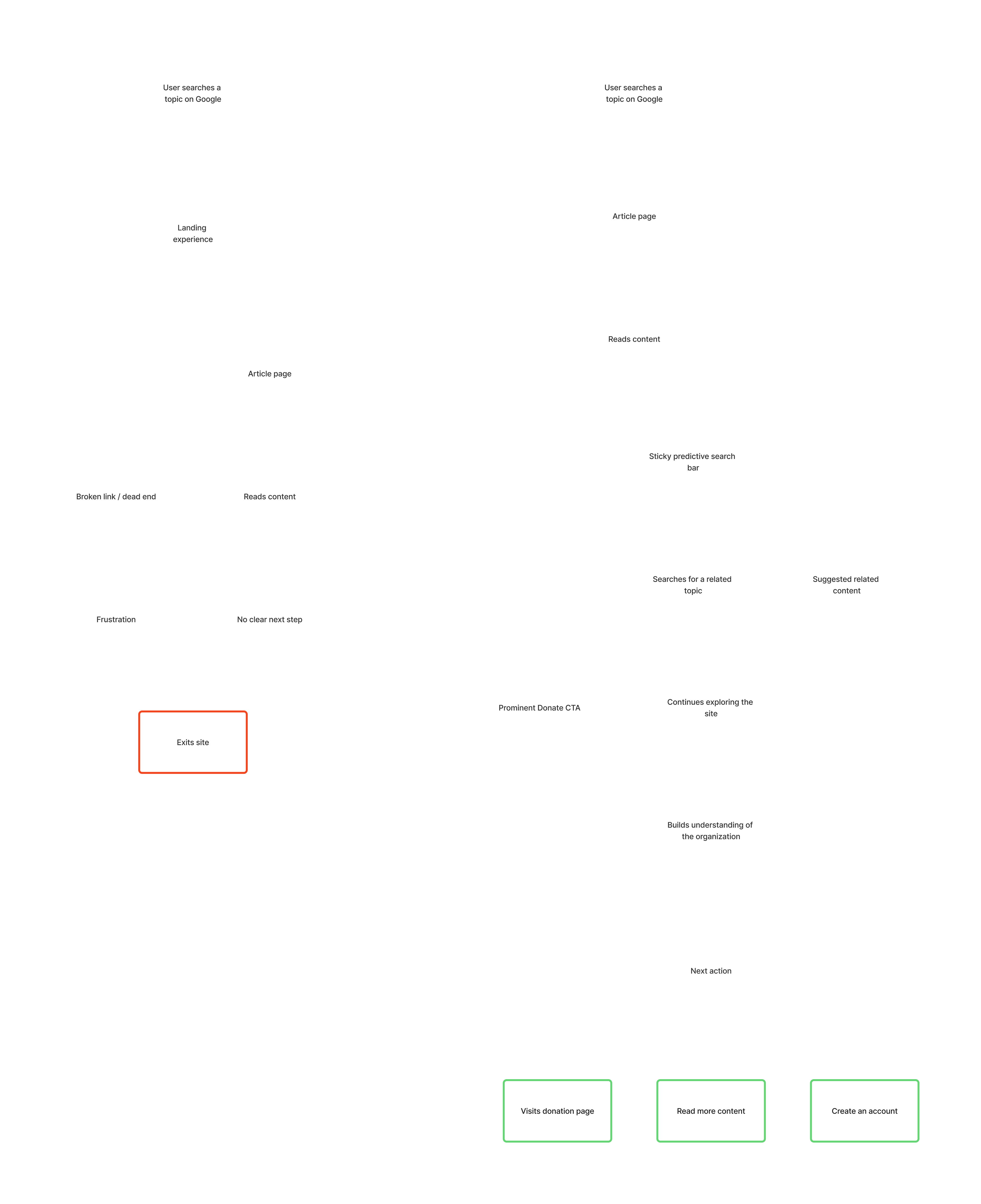
Most visitors (92%) arrived through search, landing directly on articles that matched their interests. However, these articles functioned as isolated endpoints. Once read, users had no clear path forward — no suggested content, no guidance, and in some cases, broken links created additional frustration. As a result, users would leave immediately after consuming a single piece of content.
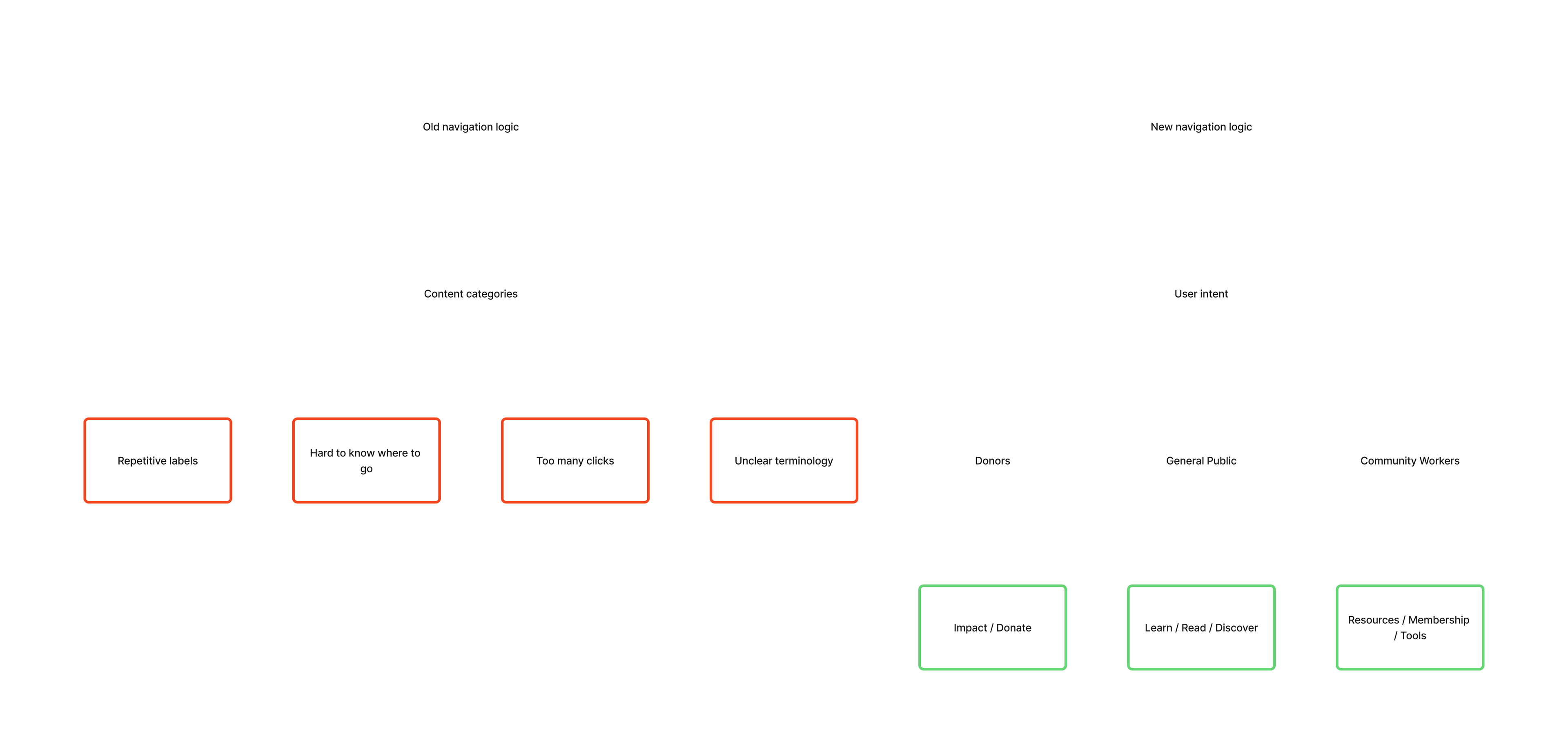
At a structural level, the site was difficult to navigate. The menu was repetitive and unclear, requiring multiple clicks to access content, and it was often hard to understand where you were within the experience. The distinction between public content and member-only resources was also blurred, making it difficult for users to understand the value of creating an account.
The donation experience presented a similar challenge. While a donation option existed, it was buried within the navigation and relied heavily on long-form text to explain its purpose. Important information about impact and outcomes was difficult to access, assuming a level of curiosity and patience that did not reflect actual user behavior.
More broadly, the organization struggled to adopt a user-centered and conversion-oriented mindset. As a mission-driven non-profit, there was hesitation around “selling” the value of their work, which made it difficult to structure the experience in a way that supported engagement and action.
From dead-end visits to guided exploration
My Role & Approach
I led the UX strategy from discovery through to execution, facilitating workshops, defining the structure, and designing the experience.
A significant part of my role involved guiding the organization through a shift in perspective — helping them understand how user behavior, content strategy, and conversion goals could coexist with their mission. This required balancing strong advocacy for user needs with an openness to adapt when constraints or priorities evolved.
Strategic Approach
The first step was to reframe how the organization viewed its audience.
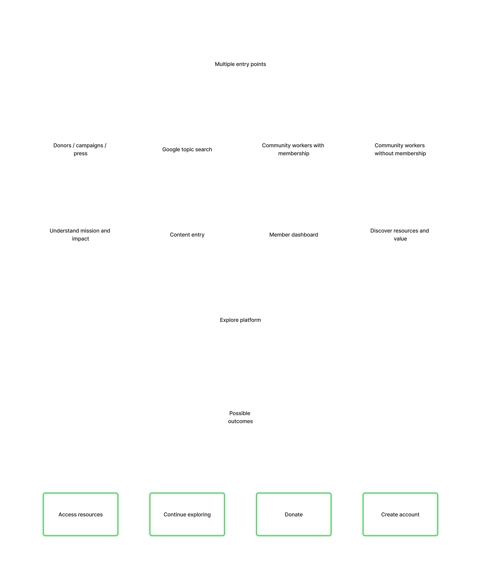
Although the general public represented the vast majority of traffic, this group was initially dismissed as irrelevant to the organization’s core mission. Through persona development and journey mapping, we demonstrated how this audience could instead serve as an entry point — building awareness, trust, and ultimately contributing to donation.
From there, the experience was restructured around user intent. Rather than organizing content based on internal logic, we introduced clear pathways for three primary audiences: general users, community workers, and donors. This shift brought immediate clarity to the navigation and reduced the effort required to access relevant information.
At the same time, we introduced a more deliberate approach to conversion. The platform was no longer treated as a purely informational resource, but as a guided experience with defined entry points and outcomes. This included elevating key calls to action, simplifying messaging, and creating dedicated landing pages to support both membership growth and fundraising efforts.
Throughout the process, I worked within the organization’s constraints. When the client chose not to expose certain content in the main navigation, alternative discovery mechanisms were introduced to maintain accessibility without compromising their preferences.
Simplifying navigation through user intent
Solutions
The redesign focused on bringing structure, clarity, and direction to the experience, while making better use of the organization’s existing content.
The navigation was rebuilt around user intent, introducing clear entry points for each audience and significantly reducing redundancy. This made it easier for users to understand where they were and how to move through the platform.
To address the high drop-off from article traffic, the content ecosystem was reworked to encourage exploration. Articles were connected through related content, allowing users to move naturally between topics instead of reaching a dead end.
Because resource content was not included in the main navigation, a predictive, topic-based search was introduced as an alternative entry point. This allowed users to quickly access relevant materials based on their interests, while reducing the likelihood of unsuccessful searches. A redesigned mega menu further supported discovery by highlighting key content tailored to each user type.
The donation experience was simplified and reframed to better communicate impact. Rather than relying on long-form explanations, the content was structured to highlight outcomes more clearly, supported by visual elements such as a donation calculator that translated contributions into tangible results.
On the member side, the experience was expanded to better reflect the value of the offering. The dashboard was redesigned, and the registration process was enhanced to allow for content personalization, giving users more control and a more relevant experience over time.
Structuring a multi-entry experience
Results & Impact
While long-term analytics are still evolving, the impact of the redesign is already visible across multiple levels.
Users are engaging more deeply with the platform, navigating beyond a single article and exploring additional content. Membership creation has increased, supported by clearer pathways and a more visible value proposition.
Key calls to action, particularly around account creation and donations, are receiving significantly more interaction. Although the donation platform itself remains external, the improved clarity of messaging has strengthened the organization’s ability to drive users toward it.
Internally, the impact has been equally important. Content teams have reported a much smoother experience managing the platform, and the organization as a whole has developed a clearer understanding of its audience, its offer, and how to communicate its value.
The success of the project also led to an ongoing collaboration, with the organization continuing to invest in iterative improvements and new functionality over time.
What this project demonstrates
This project highlights my ability to structure complex, multi-audience platforms and guide organizations through strategic shifts in how they approach their users.
It reflects a balance between user-centered thinking and organizational realities, as well as a focus on building systems that support both engagement and long-term growth.