This project is presented under a pseudonym for confidentiality reasons.
Context
Atlas Health & Performance is a multi-service business offering gym access, wellness services, and a retail component including supplements and apparel.
The platform supported a wide range of offerings but struggled to convert users effectively. The primary business goals were to increase repeat purchases, drive appointment bookings, and reduce user drop-off across the site.
The Problem
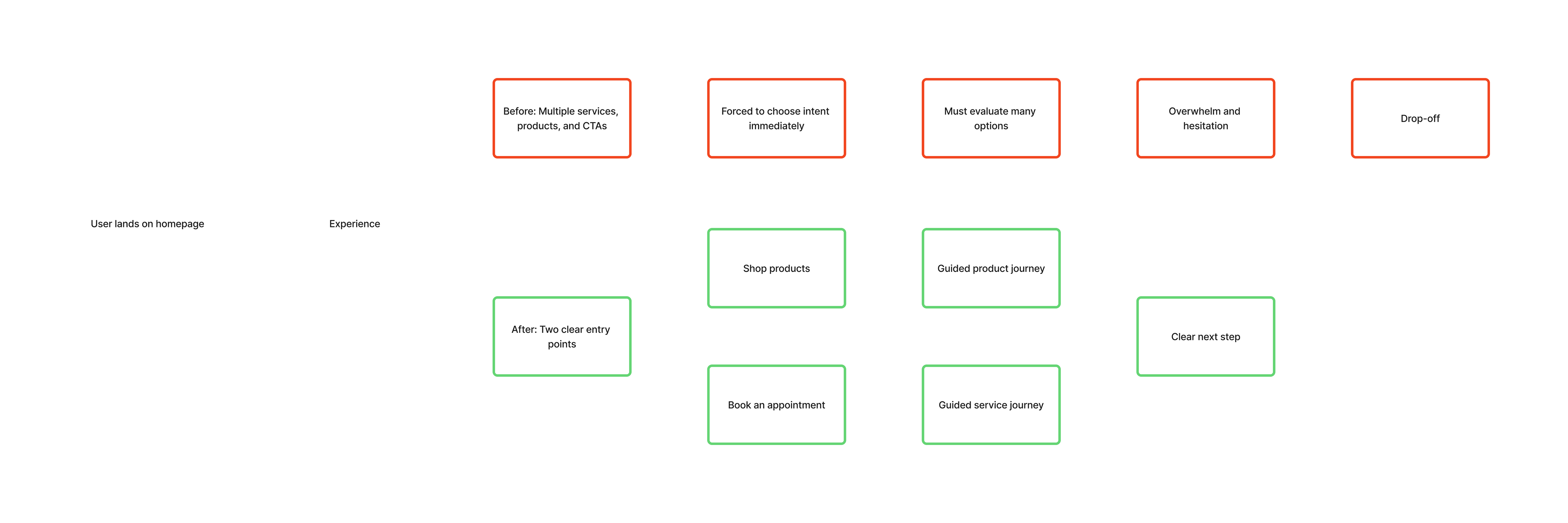
The experience overwhelmed users at the point of entry.
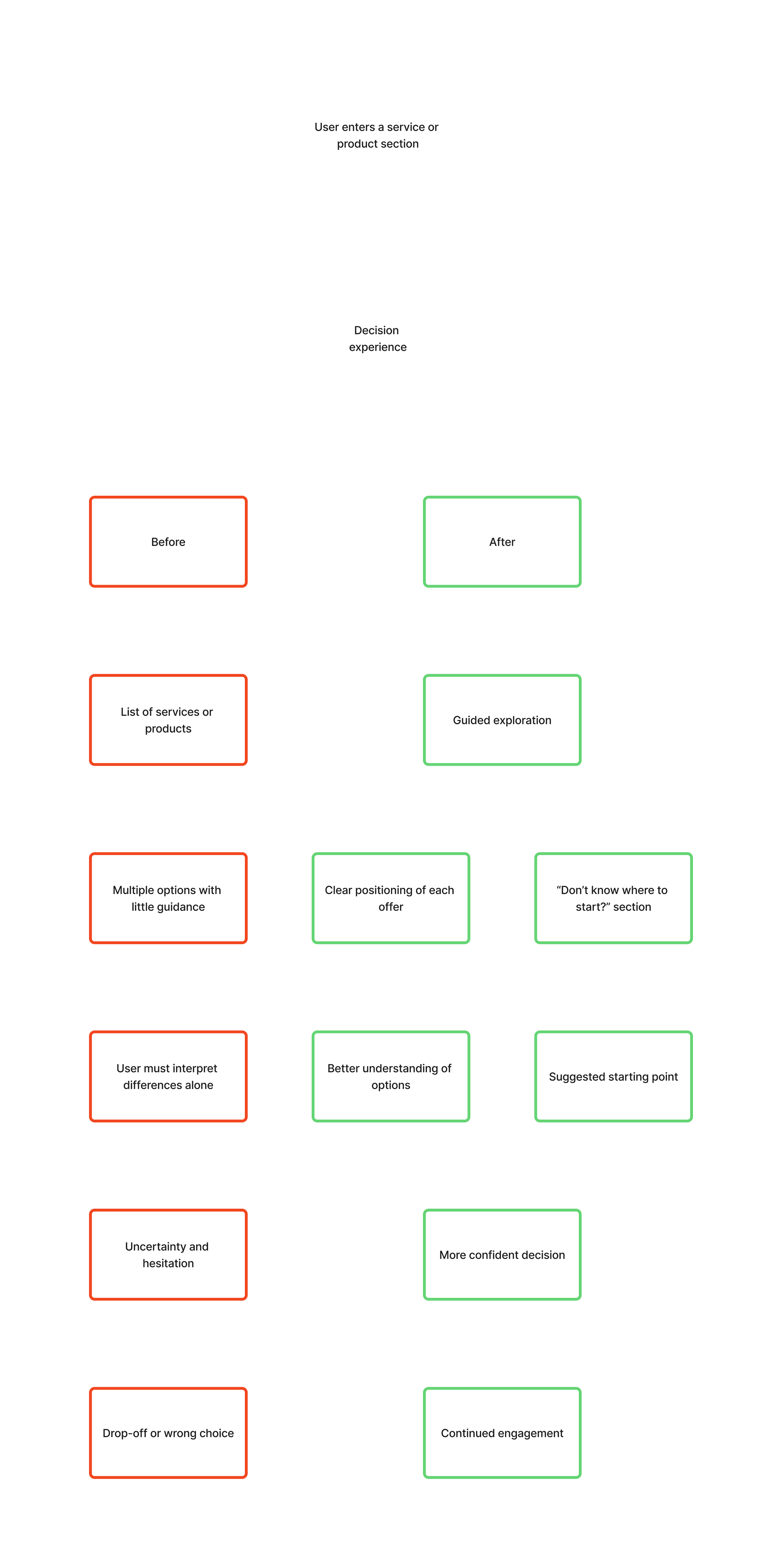
The homepage presented a wide range of services and products simultaneously, with no clear hierarchy. Users were immediately asked to choose their intent from a large set of options, repeated across multiple sections and calls to action. This required users to read and evaluate numerous options before understanding what was relevant to them.
This created significant friction. Users struggled to identify where to start, and many dropped off before taking action.
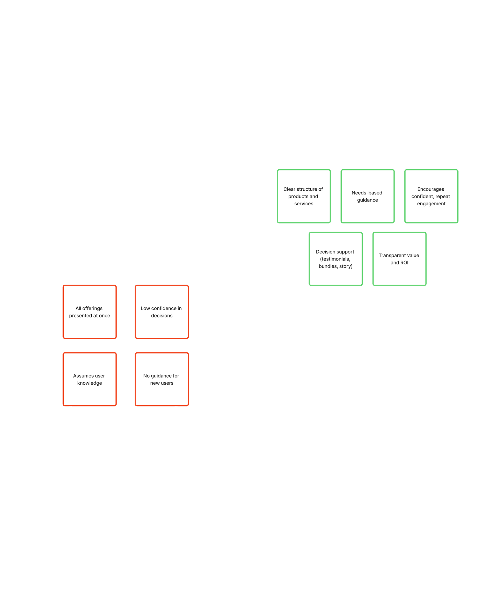
The issue was compounded by a lack of clarity and confidence in the offer. Services did not clearly communicate expected outcomes, and product discovery relied on filters suited to knowledgeable users rather than general audiences. Appointment booking required users to call or visit in person, adding additional barriers to conversion.
Visually, the experience reinforced a narrow perception of the brand. The dominance of gym-focused imagery made it difficult for users seeking wellness services to identify with the offer.
Key Insight
Users were being asked to make decisions before they had enough context or confidence to do so.
Before choosing a service or product, users needed to understand what was relevant to them and trust the value of the offer.
Approach
The experience was redesigned to support confident decision-making by:
Reducing upfront complexity
Guiding users based on clear intent
Increasing confidence before asking for commitment
Rather than exposing the full range of offerings immediately, the platform was restructured to lead users through a more focused and progressive journey.
Solutions
The redesign focused on reducing decision friction and guiding users toward clear actions, while strengthening confidence in both services and products.
Simplifying Entry Points
The number of initial choices was significantly reduced to prevent early overwhelm.
Two primary calls to action were introduced:
- Book an appointment
- Shop products
These options reflected the two main user intents and provided a clear starting point without requiring users to evaluate the full range of services upfront.
Restructuring the Conversion Flow
To remove barriers to action, the booking experience was redesigned.
An online booking system was implemented, allowing users to schedule appointments directly through the platform rather than relying on phone or in-person interactions. This reduced friction and aligned the experience with user expectations.
Improving Product Discovery
The product experience was redesigned to support users with varying levels of knowledge.
Filtering logic was reworked to reflect user needs rather than technical attributes, making it easier for less experienced users to navigate the offering. Guided pathways were introduced to help users identify relevant products based on their goals.
Increasing Confidence in the Offer
Several changes were made to reduce hesitation and support decision-making:
- Clearer framing of expected outcomes and value (including bundled offers)
- Introduction of testimonials to reinforce credibility
- Addition of onboarding-style guidance for users unsure where to begin
Together, these elements helped users better understand what they were committing to and why.
Strengthening Long-Term Engagement
A subscription model was introduced across products, alongside bundled offerings designed to communicate value more clearly.
This shifted the experience from one-time transactions to ongoing engagement, supporting the business goal of repeat purchases.
Aligning Experience with User Expectations
Visual and structural changes were made to better reflect the diversity of the offering.
Imagery and content were adapted across sections to align with different user motivations, making it easier for users to recognize themselves in the experience. Navigation labels were also revised to be more action-oriented and user-focused, improving clarity and discoverability.
Impact
The redesign led to measurable improvements in both user behavior and business outcomes.
User drop-off decreased significantly, particularly at key entry points where decision friction had previously been highest. Appointment bookings increased following the introduction of online scheduling, and the product experience saw higher engagement through the addition of subscriptions and bundled offers.
Qualitative feedback from existing clients highlighted the improved usability of the platform, with particular appreciation for the ability to book services online.
Overall, the platform evolved from a fragmented experience into a more guided and conversion-oriented system, supporting both immediate actions and long-term engagement.